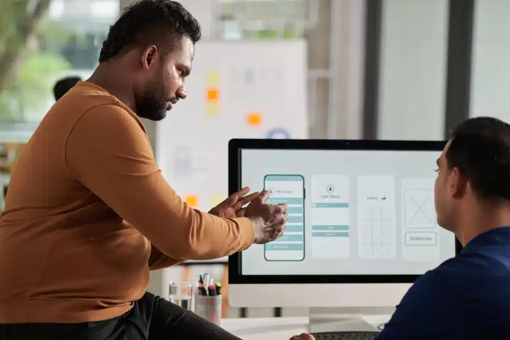
In an era where digital attention spans are shrinking and user expectations are higher than ever, one of the most overlooked aspects of web design is navigation.
A beautiful, well-branded website can still fail if users find it confusing or difficult to use. Navigational simplicity isn’t just a design preference—it’s a fundamental component of successful user experience (UX) design.
This blog explores the importance of intuitive user journeys, the pitfalls of poor navigation, and actionable strategies to streamline digital pathways for maximum engagement.
Whether you’re building a new website or refining an existing one, understanding the role of navigational simplicity can transform your digital presence.
Why Navigational Simplicity Matters
Reducing Cognitive Load
Users don’t visit websites to admire design intricacies—they come with goals. A complex or cluttered navigation forces users to think more than necessary, increasing cognitive load and frustration. Simplified navigation helps users find what they’re looking for quickly, making them more likely to stay, engage, and convert.
Boosting Engagement and Retention
When users can navigate effortlessly, they’re more inclined to explore different parts of your site. Higher engagement often leads to lower bounce rates, longer session durations, and increased trust in your brand. Navigational simplicity builds a strong foundation for positive user behavior.
Enhancing Accessibility
Clear and consistent navigation is essential for users with disabilities. Screen readers, keyboard navigation, and other assistive technologies rely on predictable, logical layouts. Navigational simplicity ensures your site is inclusive and accessible to all users.

Common Navigation Mistakes That Hurt UX
Overloaded Menus
Too many choices can paralyze users. When menus are packed with options, users may feel overwhelmed and unsure of where to go.
Unclear Labels
Using jargon or vague labels like “Stuff” or “More” doesn’t help users understand what they’ll find when they click. Labels should be straightforward and action-oriented.
Inconsistent Layouts
If navigation varies from page to page, users must re-learn how to move around your site, leading to confusion and frustration.
Hidden Navigation (e.g., hamburger menus on desktop)
Hiding navigation behind icons or interactions that aren’t universally understood can hinder usability, especially on desktop experiences.

Designing for Navigational Simplicity
Limit Primary Navigation Items
Stick to a small number of primary links—ideally 5 to 7. Use submenus or dropdowns for secondary content to keep the top-level menu clean.
Prioritise Based on User Intent
Identify what your users are most likely to be looking for, and make those items the most prominent. This might include “Services,” “Pricing,” or “Contact.”
Use Clear and Descriptive Labels
Navigation labels should make sense without context. Replace creative or branded language with plain, universally understandable terms.
Maintain Consistency Across Pages
The navigation structure and appearance should remain the same across all pages, helping users build familiarity and confidence.
Design for Mobile First
Mobile users often make up more than half your audience. Design a navigation structure that works perfectly on small screens, then scale up to desktop.

Enhancing Navigation with UX Best Practices
Implement Visual Hierarchy
Use typography, color, and spacing to visually distinguish primary links from secondary ones. A clear hierarchy helps guide the user’s eye.
Add Breadcrumbs
Breadcrumbs offer a secondary form of navigation and let users know where they are within the site structure, allowing easy backtracking.
Incorporate Search Functionality
For larger sites, a well-functioning search bar can dramatically improve user experience, especially when paired with auto-suggestions.
Utilise Sticky Navigation
Sticky menus that remain visible as users scroll provide quick access to navigation without the need to scroll back to the top.
Test and Iterate
Regularly test your site navigation with real users. Use heatmaps, click tracking, and A/B testing to identify pain points and make informed adjustments.
Real-World Examples of Effective Navigation
Apple
Apple’s navigation is famously simple. Top-level categories are limited, the language is clear, and mobile navigation is just as polished.
Airbnb
Airbnb excels in contextual navigation. Based on what users are doing (booking a stay vs. hosting), different pathways are presented without overwhelming the interface.
Dropbox
Dropbox keeps its navigation minimal and focused, allowing users to take direct action without distraction.

Tools and Techniques to Assess Navigation
Google Analytics and Behaviour Flow
Review how users move through your site to identify common drop-off points and unexpected navigational bottlenecks.
Heatmapping Tools (e.g., Hotjar, Crazy Egg)
See exactly where users are clicking, scrolling, and hovering. These insights help identify areas of confusion or neglect.
User Testing Platforms (e.g., Maze, UserTesting)
Gain direct feedback from real users interacting with your site. Identify what they find intuitive and what they don’t.
Card Sorting Exercises
Card sorting helps you understand how users group content and what labels make the most sense to them.
The Future of Navigational Design
Voice Navigation
With the rise of voice interfaces, navigation will extend beyond visual cues to spoken prompts. Designing for voice requires even more clarity and simplicity.
AI-Powered Personalisation
AI can tailor navigation based on user behaviour and preferences, creating dynamic menus that adapt in real-time.
Gesture-Based Interfaces
Wearables and IoT devices are bringing gesture-based navigation to the forefront, demanding even more intuitive interaction design.

Let Simplicity Lead the Way
Intuitive navigation isn’t just a convenience—it’s a necessity. In today’s fast-paced digital environment, users expect seamless experiences that help them accomplish their goals with minimal effort. By embracing navigational simplicity, you ensure your users remain engaged, satisfied, and loyal.
At Olando Digital Design, we specialise in crafting intuitive web experiences rooted in navigational simplicity. Our user-focused design philosophy ensures that every click, tap, or swipe leads users closer to their goals. Whether you need a full website build or a UX refresh, we’re here to help create digital journeys that just make sense.
Let simplicity be your strategy. Contact us today to streamline your user experience and boost engagement.


