In 2024, the importance of responsive web design is more pronounced than ever.
As technology continues to evolve and the number of internet-connected devices multiplies, ensuring a seamless and accessible experience across all platforms has become a necessity for businesses and individuals alike. From smartphones and tablets to laptops, desktops, and even wearable tech, users expect websites to function flawlessly, regardless of the device they are using.
This blog explores why responsive web design is crucial in 2024, the benefits it offers, and the key strategies for implementing it effectively. By understanding and adopting responsive design principles, you can ensure your website remains accessible, user-friendly, and relevant in an increasingly diverse digital landscape.
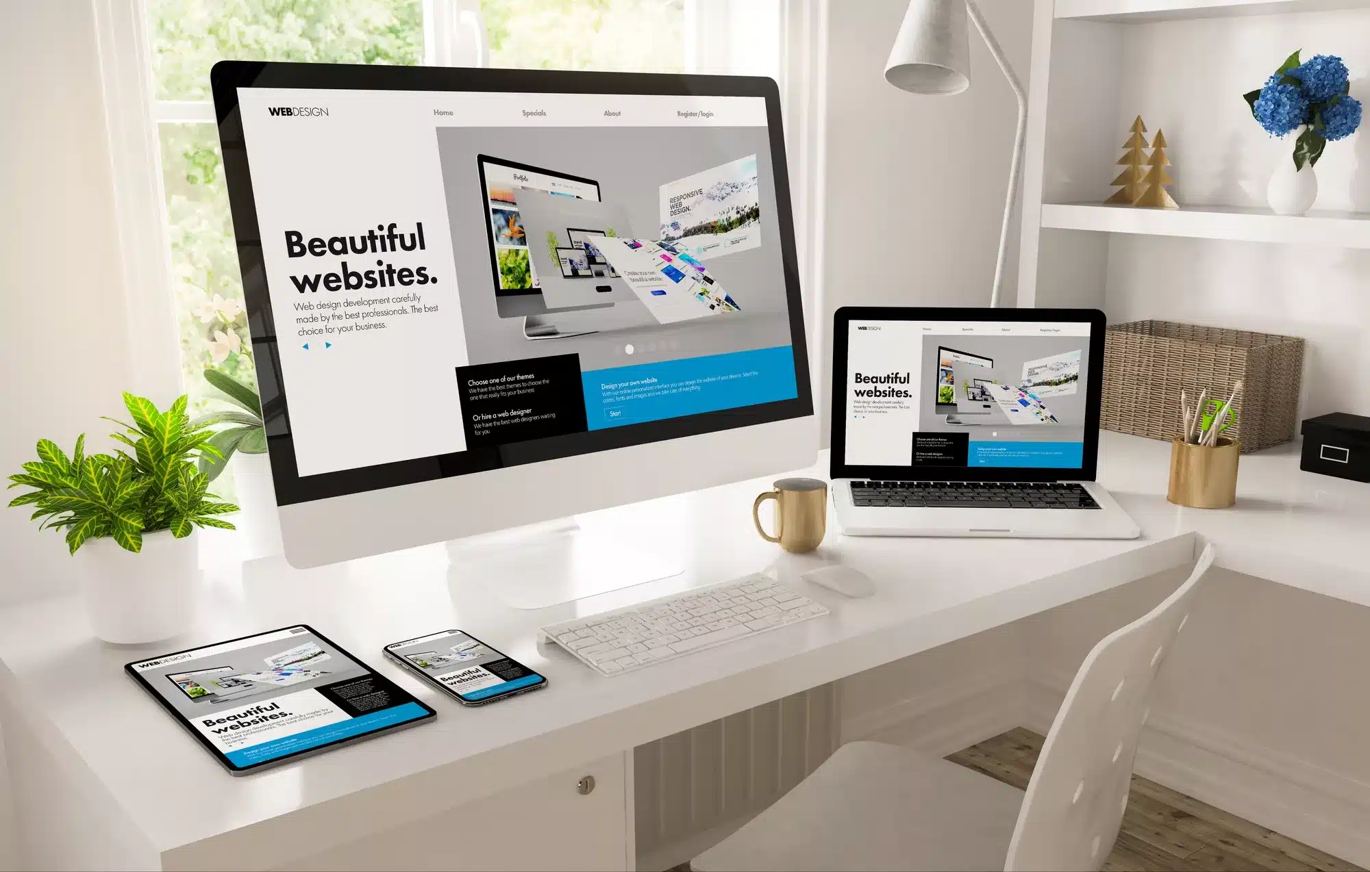
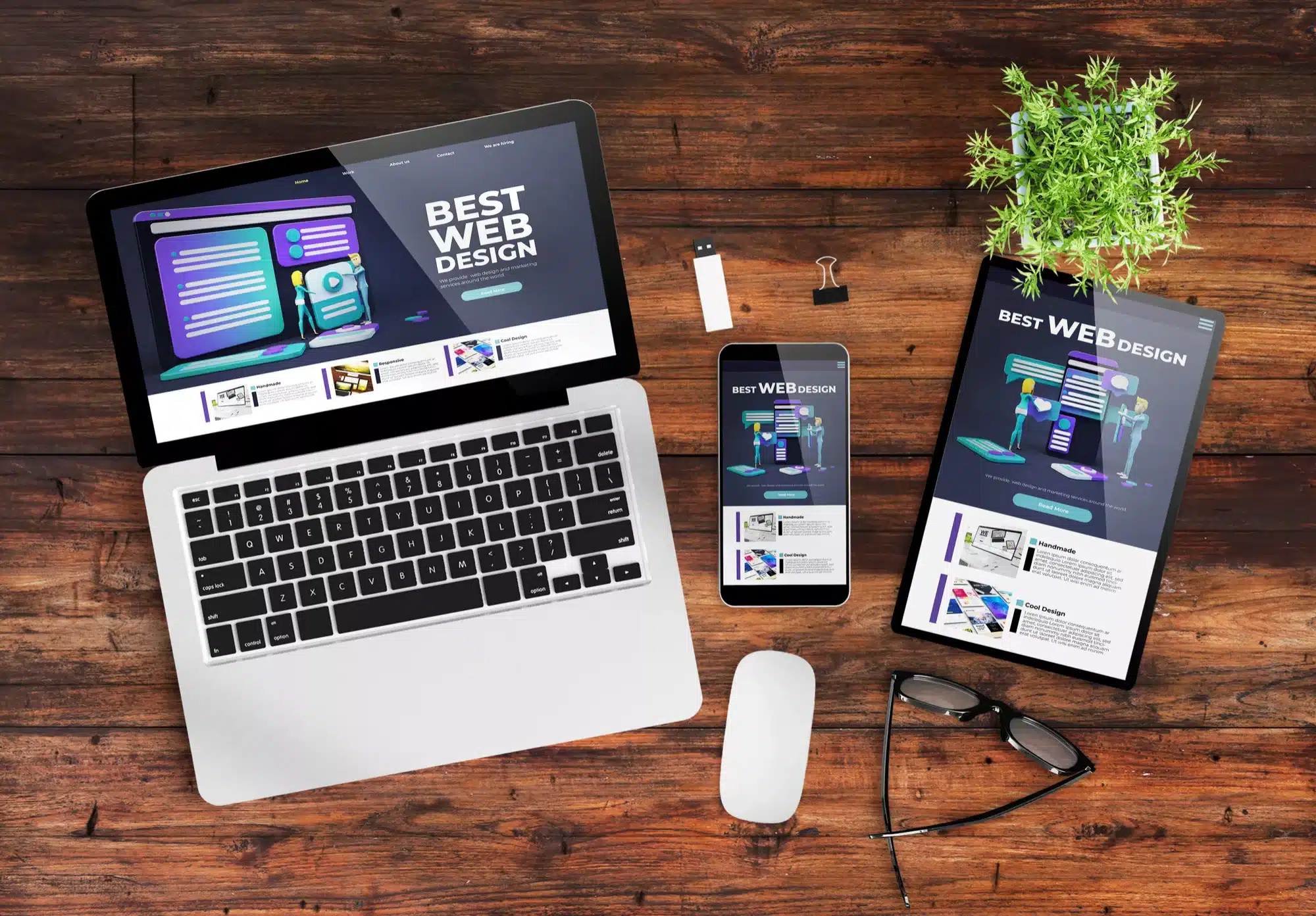
Understanding Responsive Web Design
What is Responsive Web Design?
Responsive web design (RWD) is an approach to web development that ensures a website’s layout, content, and features adapt smoothly to various screen sizes and resolutions. It aims to provide an optimal viewing and interaction experience across different devices, from large desktop monitors to tiny smartphone screens.
Key Principles of Responsive Design
- Fluid Grids: Layouts built on a flexible grid structure that scales proportionally to the screen size.
- Flexible Images: Images and media that adjust within the fluid grid, ensuring they don’t overflow or look distorted.
- CSS Media Queries: Code that applies specific styles depending on the device’s characteristics, such as screen width, height, orientation, and resolution.
- Viewport Meta Tag: Tells browsers how to adjust the page’s dimensions and scaling to fit different screens.
Why Responsive Design Matters in 2024
The digital landscape has become more complex, with users accessing the web through an ever-growing array of devices. In 2024, responsive design is no longer just a best practice—it’s a critical requirement. Here’s why:
Mobile Usage Continues to Dominate
With over 60% of global internet traffic coming from mobile devices, optimising websites for mobile is no longer optional. Users expect websites to be fully functional and visually appealing on their smartphones. Without responsive design, websites risk alienating a significant portion of their audience.
Growing Variety of Devices
The rise of wearable tech, smart TVs, and various IoT devices means users are accessing the web from a broader range of screens than ever before. Responsive design ensures your website remains accessible, regardless of the device being used.
SEO Benefits
Google and other search engines prioritise mobile-friendly, responsive websites in search results. A responsive design improves SEO by ensuring fast loading times, lower bounce rates, and a positive user experience, all of which are critical ranking factors.
Enhanced User Experience
User experience (UX) is paramount in 2024. A responsive website adapts to the user’s device, offering a seamless experience that keeps users engaged and reduces frustration, ultimately leading to higher conversion rates.

Benefits of Responsive Web Design
Improved Accessibility for All Users
Accessibility is a core aspect of responsive design. By ensuring a website works well on all devices, you make it accessible to everyone, including users with disabilities who may rely on different devices and screen sizes.
Inclusive Design Principles
- Screen Readers: Ensure text and images are properly coded for screen readers, which help visually impaired users navigate your site.
- Colour Contrast: Maintain sufficient colour contrast to assist users with visual impairments.
- Keyboard Navigation: Make sure users can navigate your site using a keyboard or other assistive devices.
Higher Conversion Rates
A responsive website caters to the needs of all visitors, making it easier for them to find what they’re looking for and complete desired actions. Whether they’re filling out a form, making a purchase, or signing up for a newsletter, responsive design helps reduce friction, leading to higher conversion rates.
Streamlined Purchase Paths
- Clear Call-to-Action (CTA): Position CTAs prominently and make them easily tappable on all devices.
- Simplified Checkout Processes: Ensure that the checkout process is easy to navigate, even on small screens.
Reduced Maintenance Costs
Maintaining separate websites for desktop and mobile is time-consuming and costly. A single responsive website is easier to manage, update, and optimise, saving time and money in the long run.
Centralised Management
- Unified Codebase: Use a single codebase that applies across all devices, simplifying updates and maintenance.
- Consistent Branding: Ensure that brand elements are consistent across all devices, reinforcing your brand identity.
Enhanced SEO Performance
Google’s mobile-first indexing means that the mobile version of your website is the primary version considered for search rankings. A responsive design improves your website’s SEO performance by ensuring it meets all of Google’s requirements for mobile-friendliness.
Key SEO Benefits
- Faster Loading Times: Optimised images and clean code reduce loading times, which is critical for SEO.
- Lower Bounce Rates: A responsive design decreases bounce rates by providing a better user experience.
- Improved Dwell Time: Engaging, responsive websites keep users on the page longer, improving dwell time and boosting SEO rankings.

Key Strategies for Effective Responsive Web Design
Start with Mobile-First Design
Mobile-first design prioritises the mobile experience from the outset, ensuring the website is fully optimised for smaller screens before expanding to larger ones.
Benefits of Mobile-First Design
- Focus on Essentials: Forces designers to prioritise essential content and functionality, removing unnecessary clutter.
- Improved Performance: Faster loading times and better usability for mobile users.
Utilise Fluid Grids and Flexible Layouts
Fluid grids use relative units like percentages instead of fixed units like pixels, allowing elements to resize proportionally based on the screen size.
Implementing Fluid Grids
- Use CSS Frameworks: Frameworks like Bootstrap and Foundation offer built-in grid systems for responsive layouts.
- Flexible Media: Ensure that images, videos, and other media scale properly within the fluid grid.
Leverage Media Queries
Media queries allow you to apply specific styles based on the characteristics of the user’s device, such as screen size, resolution, and orientation.
Best Practices for Media Queries
- Set Breakpoints Thoughtfully: Use common device breakpoints (e.g., 320px, 768px, 1024px) but also consider the context of your specific audience.
- Avoid Overuse: Use media queries judiciously to avoid bloated code and maintain performance.
Optimise Images and Media for Performance
Images and media are often the biggest contributors to slow loading times on websites. Optimising these elements is critical for responsive design.
Techniques for Optimisation
- Use Modern Image Formats: Utilise formats like WebP that offer better compression without losing quality.
- Lazy Loading: Implement lazy loading to defer loading images until they are needed.
Ensure Touch-Friendly Navigation
Design navigation that is easy to use on touch devices. Avoid small buttons and links that are difficult to tap.
Designing Touch-Friendly Interfaces
- Use Larger Buttons: Make buttons and touch targets large enough for easy tapping.
- Minimise Dropdown Menus: Simplify navigation by avoiding complex dropdown menus that are hard to use on mobile devices.
Measuring the Success of Your Responsive Design
Key Metrics to Monitor
To evaluate the effectiveness of your responsive design, it’s essential to monitor specific performance metrics.
Core Metrics to Track
- Bounce Rate: Monitor bounce rates across devices to identify any issues with your responsive design.
- Conversion Rate: Track conversions on different devices to ensure a consistent experience.
- Page Load Time: Measure load times for all devices to identify areas for improvement.
Tools for Monitoring Performance
There are various tools available to help you monitor and improve the performance of your responsive website.
Recommended Tools
- Google Analytics: Offers detailed insights into user behaviour across devices.
- Google PageSpeed Insights: Provides recommendations for improving loading times.
- Browser Developer Tools: Use built-in browser tools to test responsiveness across different screen sizes.

The Future of Responsive Web Design in 2024 and Beyond
Emerging Trends in Responsive Design
The world of responsive design continues to evolve. Here are some trends to watch in 2024 and beyond:
Voice User Interfaces (VUIs)
As voice search and virtual assistants become more prevalent, designing for voice-based interactions will become a critical aspect of responsive design.
Responsive Design for Wearables
With the growing popularity of wearables like smartwatches, designing for smaller, less conventional screens will become increasingly important.
Preparing for the Next Wave of Devices
The rise of new device types, such as augmented reality (AR) glasses and foldable screens, will challenge designers to think beyond the current landscape.
Adapting to New Technologies
- Adaptive Layouts: Create layouts that dynamically adjust based on the unique characteristics of new devices.
- Context-Aware Design: Develop interfaces that adapt based on the user’s context, such as location or activity.

Conclusion: Embracing Responsive Design for Future Success
Responsive web design is more than just a trend; it’s a fundamental aspect of creating accessible, user-friendly digital experiences in 2024. By understanding its importance, leveraging its benefits, and implementing effective strategies, you can ensure your website remains relevant, engaging, and accessible across all devices. As the digital landscape continues to evolve, responsive design will remain a critical factor in achieving online success.
Ready to enhance your website’s responsiveness and accessibility? Contact Olando Digital Design today to learn how our responsive design services can help you create a seamless, inclusive experience for all users.

